I was offered the chance of lecturing in photography to sixth form college media, design and visual communication students and I wondered where I should start in talking about true image qaulity, not just the pixel peeping IQ of the talentless technophiles.
I came upon a kind of Venn diagram as a way of showing how the various forces interact with the "sweet zone" where they all overlap.
<I chose the following as you will see as three spheres or you could think of them as axis too, where a single photo has a "plot point" where it falls in relation to the three poles.
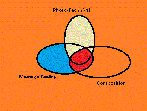
As you see I have chosen to represent the sweet zone as the center where all three converge but also where composition and "take out" feeling or message converge because here you may not start with a technically particularly good photograph.
This venn my friend ! It is aimed at when you are out taking shots, on a shoot, and what you should be thinking about when you are preparing for a shot, and what you may want to experiment with.
Technical is all about exposure and focus, but also you can include some post processing improvements: for me in as an E450 user, this means "Pushing the negative" like old days, shooting a little dark at a lower ISO 200/ 400 max and then pulling out detail in the shadows and altering the overall exposure in post'.
Composition revolves around two main concepts- does the photograph have a distinct subject which should be the emphasis of what you want to capture and convey? Or is there a wider composition such as a landscape, a street scene, a pattern in nature or a real Brugel-the-Elder image of the masses ? This is worth a blog in it's own right, in this blog then we concentrate on Subject emphasised images.
Are you then achieving an overall artistic feeling or a particular message you want to convey? Or have you found something new? Has post proc' editing revealed something, such as close up details, high-tone or low-tone, which you could integrate to your setttings and composition in the field or studio ? This is worth endless bloggs - - as many as there are photographers and photographic shoots!
You can also use this as a wheel: At the top of the wheel you have a simple check that you have at least the camera on a standard P setting or your preferred aperture or shutter priority. This is not taken for granted! My E450 camera holds the previous sessions software settings and at the moment that has been on firework and candle where Oly's art filters actually surpass my own manual and post processing attempts!
You can actually leave your last shoot by setting the camera to your preferred "Base Settings" to steel a rig tuning term from sailing- this is a good discipline. Or for example if you have a fast lens on ( f2.8 or faster) then you may want to set up aperture priority, max open aperture or fast shutter speed on S - if the camera has good-acceptable high ISO performance then you may want to set this on AUTO - some cameras allow you to limit the range it hunts in, but this in most cameras means that it will go to ISO 100 in bright conditions and 1600 in dark.
Alternatively of course you have the scenario of the day, shoot or moment in front of you and you want to go through a quick sanity check of the best forseeable settings you then dial in.
Here I have split the arrow up because there are a series of relevant settings you have to double check to establish the technical basis for your shots : you have of course shutter as a real key here I will come back to, but if you are hand-holding on a non image stabilised camera then you need really 125th of a second absolute minimum for still subjects and 300th for moving subjects as a rule of thumb. This means either selecting shutter priority and on my camera as above, AUTO iso or having a check of what the camera is offering you in shutter speed on P (programme).
The next is to think of the aperature and the type of depth-of-field you will be achieving with the lens: a fast sub f2 lens will require more careful selection of focal points on your subject and you may want to focus-bracket (some but very few cameras have auto focus bracketing , alternatively you can use Live View focus peaking to show what areas are in focus on more modern Olympus offerings etc)
Here you have a scenario: taking a shot of a moving sports car on a shower ans sunshine day with the Olympus Zuiko 50-200mm f2.8 SHG lens on any E series camera except the newest E5 for this arguement.
1) Shutter- you will want to use shutter priority. Given you have cloudy and then sharp light conditions, if you are happy with ISO 800 then set this as a limit in AUTO or be prepared to post process darker images. 1/1000th up-over which will be placing you on max aperture which then of course affects DOF ( depth of field) as does the telephoto length.
2) This lens has very fast focusing but on a sports car it may chose the wrong point and this lens is a PDAF optimised Sonic Wave Drive focusing which means that it will not track the subject and may miss focus on background in particular. Also you have the DOF issue with your chosen focal length- see below in composition.
So now you have a couple of options: a try and manually track the car and shoot - which should be okay on a shorter end at equiv to 100mm on a 35mm camera of old- a portrait legnth likely to be capturing the whole car on a fairly level race track.
However at the high end of magnification on the zoom, when you are maybe going for a cockpit and driver shot, at equiv 400mm (200 maximum on the lens) then you may want to prelock the focus - you can experiment luckily with the beauty of digital cameras now- in two ways -
a) half holding the shutter- this is fine, focus on the piece of track you expect the car to run onto which should be fairly predicable and as the car approaches having second guessed this, fire off a series of shots ( oh you will want to have multi burst shooting selecting in settings- maximum frames per second upon shutter release until you remove your finger!)
You will want to select the centre point only in the PDAF focal menu
b) olympus hides a little focus lock on the AEL/AFL button which takes a bit of finding in settings and is really annoying if you leave it on BTW! However this gives you a hands free way of pre-locking the photo- it works the same as half depress but you use the AEL/AFL button / function when you have the point you want and then it is held until you press the button again.
The latter overcomes some of the issues that olympus has versus the superior Nikon DSLRs for example- olympus E-series lens-camera systems can hunt and be too slow or select a point long in the distance.
Olympus really missed a simple trick for all their lenses which could have been a system update or integrated to the last few of E series cameras - E30, E620, E450 and E5: Focal Range Locking - which would limit the hunting on SWD and the Contrast Detect Optimised lenses to a set range and fire off a default shot mid range if nothing focuses.
The whole area of focus bracketing and focal range locking is very under developed in cameras IMHO especially for sports photography. Half release is of course a no-brainer for maybe 95% of enthusiast and pro' cameras situations, but there are especially sports,macro, wild nature and street people photos which could benefit greatly from such in camera features.
4) Now you come to composition and that in this case relates to the zoom magnification and what you want to have in the frame. Luckily motor races tend to have warm ups and many tens of laps so you have time to experiment, but unluckily today you have vastly varying light conditions.
Composition here will be a lot about what your own preferences are, but you may want to convey more of the speed and drama. Back to the drawing board? Do you want a panning - blurred effect ?
5) You then want to consider what effects and artistic impression you are getting and if you are capturing what you want to from the action: which is just that- are you just freezing the cars in a non dramatic way, as if they are just toys arranged on the course?
Do you want to run off a hundred panned shots with driver cockpit- helmet as the main subject content of the photo? Do you want to separate out the back ground more by using exposure or angle ? eg a high key image where you white out the sky by using a low angle on the subject as the cars maybe descend a rise.
Aha, here comes in a composition basic- no zoom lens will get you into the best spot to compose your photo from - you have to get yourself there, and as above the DOF at the longer telefocal end may influence your choice of stand point and of course lens: you may want to back up to achieve hyperfocal distance on your subject, or move in to blur background-foreground relatively more.
Appraising Your Test Shots from "Brand's Hatch" Racing Day Shoot
Most likely you will encounter two or three issues with your first test shots today
1) Boring Composition
2) Technically Poor images
3) Poor Figure-Ground Separation
4) Lack of Artistic Merit or Relevance to Objective
1) Boring Composition : I covered this above so read back if your images are "so what!?" : it relates very much to the composition diametry- you either have a complete composition scene- in this case the whole field of cars, or maybe the cars and grandstand, that is to say the atmosphere: or you have the subject in which case you want to consider frame composition by zoom, post proc' cropping and figure-ground separation most of all.
2) Technically Poor Images : This is likely to mean out of focus, blurred by low shutter speed or camera shake in this scenario of a day's shooting at the grand prix. Also it will mean that out of maybe 200 shots you have not framed the action correctly and you have cut off interesting parts of the image, included too much junk in focus, or worse, cut off the main subject.
Alternatively you may have good composition and good sharpness but poor overall exposure and subject-background isolation.
As this is racing a classic shot is the panned shot, and you may have selected the wrong shutter speed or you are composing and shooting wrongly or you need to run off many more frames to get best results. There may be a surprising crop into a nice blurred action you did not expect to find in post, but adjusting for the day and your vantage points is the best option when you can take many shots as the race is in dozens of laps.
Many technically poor images on first appearance can be improved in post processing, or in this case, on in time for the next lap: Taking post proc' on those 200 shots you have:
a) Cropping into the action. Zoom in around and try cropping the hell You may need to add a dramatic effect such as monotone or high grain, or single colour pick out to make the crop work because you may be going into a "gainier" image ie really getting into pixel prominence or noise being more evident from high ISO images, or you want to achieve better figure-ground separation.
b) Blurring further! You may enhance the speed by blurring the subject more and do a post' proc panned effect for example.
c) Isolating the subject out by various effects: you may have cropped down to the look on a driver's face but in Olympus land the DOF is likely to be including the coweling of the engine and maybe even the crown behind are not as nicely out of focus in the Bokeh you may get from an FF:
c ) i) here you can isolate by blurring- using a mask or just freehand in post proc' as blogged on before
c) ii) or altering the exposure - the kind of reverse of all that hyper-dynamic-range fad : you constrict the dynamic range ! In other words you adjust either adjust the whole image such that the subject stands out more by utilising a high key or low key effect. Or you mask as for blurring.
c)iii) altering the colour over all or in selective masked sections: This could be very effective in motor racing- a monotone image may reduce the colour pollution in an image which portrays something of drama - the eye is lead naturally to the action. Alternatively you can mask off and selectively colour as has been trendy since Schindlers List!
4) Lack of Artistic Merit or Not Capturing your Objective
This comes back most of all to boring composition, but also to a combination of the above. Back off here though- do you want to actually capture the whole atmosphere and drama of the day? Can you take shots of the pits with the expression on drivers or mechanics and team-manager's faces ? Or the crowd? Individuals or a whole mass of people who are focused in awe at the cars or celebrating on the chequered flag?
Recovering On the shoot:
You may then come back to run off some shots on the next lap which give this improved effect in camera-
i) cropping ? - move closer or use a longer focal length, put a longer lens on. Take more shots on the subject you want to get- I suggest a) interaction between several cars 2) single car action 3) Driver close up
ii) figure ground separation ? - move lower for example to isolate against the sky, or higher to isolate against the tarmac or grass or banner boards. Use the highest apertures and the longer focal lengths, backing off if you need to in order to get the right isolation of subject. You may then also experiment with for example spot AF, low key, high key or manual adjustments by wheel turns from the programme mode or fully manual .
iv) capturing an artistic feeling: the classic is of course a panned shot where the subject - car or driver close up - is acceptably sharp while the back ground is panned out to a blur. You maybe only need to be down at 1/200th of a second to maximise the combination of panning, capturing and being able to take several shots in the second or two "window" you have to track the car. Alternatively you may want to use zoom blur but on the SWD lenses I do not know how this goes!
Other classic things are to shoot in mono and single colour retouch: You can convert all to mono later, but in camera it will let you see which exposures are most dramatic and technically acceptable as well as how much the composition may be improved by shooting mono and removing colour- pollution.
Other treatments would maybe to focus on portraits and groups of people shots rather than the racing itself.
Another basic approach could give very big artistic and dramatic feel: by getting lower and using the sky to separate the image, lending itself to high key images with dramatic over exposure and good subject isolation. This is most appropriate if you can get a shooting angle up towards the crest of a hill. The alternative "low key" is to have a high vantage point and use the tarmac to isolate out the subject. On this point, you can then use the lponger end of the 200mm SWD SHG lens to compress the images, where cars appear closer together and this is very effective when combined with the two vantage angels, lieing down low and semi ariel in particular.
In the cold light of the day after or evening pouring through the hundreds of images, you may get your biggest learning points. However out in the field, get your camera into the shadow of your coat over your head and start to check the technical IQ of the images on the camera screen, or tablet if you are on a wifi enabled system; and see if you have sharpness, any nice crop potentials, or if you have acheived good panned shots, and think about the over all composition and exposure.
In the E system cameras bar the E5, you tend to be able to save an under exposed image more than an overexposed image, so you can play with shooting faster and darker or avoid high key.
In our example of cars moving at up to 220 mph you luckily have hundreds of photo-opportunities but don't get blazee. Are you capturing good shots? Are you near enough? What is going wrong technically ?
===============================
I hope in this little blog to have stimulated thought and given a simple three-axial tool to help with your photography and your post processing.
It ran right into a perfect example for the E series Olympus DSLRs with the classic 50-200mm SWD SHG lens and this then illustrated my points very well by in large.
Søk i denne bloggen og Lenker
Viser innlegg med etiketten IQ. Vis alle innlegg
fredag 8. november 2013
onsdag 27. oktober 2010
Dynamic Range, IQ and Tonal Depth Explained ( Olympus E450 owners)
Jargon Busting!
DR: Dynamic range. Seen a histogram? This is worth delving into on your camera display and at least on Olympus viewer on your PC. It relates very firmly to the actual digital data and the quality of the capture of the scene.
IQ No, your camera is not getting more intelligent, this is just a good old subjective reference "Image Quality"
Tonal Depth: this is just as important as dynamic range: given a hue or short range of light intensity, this is how many tones can be captured (and displayed!) such that the nuances of colour and shadow over shapes, textures and colour gradients like a sunse, add to the perception of quality and the technical accuracy of the shot..
How to Define Image Quality?
Well beauty is in the eye of the beholder and you could say therefore there is a dichotomy between technical accuracy and æsthetic value:
Most shots on the Dp forum showing Olympus DR etc are very dull subjects: standard test cards, studio objects or just desk foibles and views up the street from the office or shop with the new E5 on test!
However given some form of interesting content then you can say that the key contributors to image quality are:
1) representation of the scene in either true-to the eye or, a one that gives some æsthetic which impresses at first glance.
2) sharpness : usually the subject of the photo should be sharp: and when enlarged detail remains sharp, although this is a technical sharp: see the debate on how many mpx . I like many slightly blurry portraits - it is one of my own styles. Shaprness acheived by appropriate shutter speed, tripod, image stabilisation, correct focus and associated aperture mediated DOF:
3) Appropriate Depth of Field: the subject is either the only area which is represented sharp or the whole image is sharp ( by in large these two are what is regarded as contributing to good IQ.) DOF is a whole blogg on its own and can be mimicked in image software like gimp.
4) Accurate capture of shadows and highlights. The range apparent to the eye or a range which represents some æesthetic in the image.
5) A good representation of the colours and tonal depth of those colours across their hues and light intensities in the range between the white highlights and black shadows.
Rocket Surgeons Versus Picasso De Vanci
I guess the arguement could rage between the "technicians" and the "artists" on what IQ really is, but as in a previous blog on what makes a good picture, there are both technical elements and æsthetics which you could get rated by 1000 people and come up with an IQ rating if you must.
Certainly a good technical image will lend itself to representing the scene as intended or being worked up in after effects to a new æsthetic which may have been limited if the technical qualities were not there.
My favourite portrait photographers, including Anton Cobijn - the Joy Division and U2 image man, have often rather poor technical prints: very short DR, grainyness, blur, innapporpriate DOF , underexposure. However to me they are really striking.
Way Back When....
In the old days of film, given you had a reasonably good camera, there were two main areas affectting the quality of your colour prints.
1)IThe film as bought: how good the film was relative to its' ISO. it's colour "hue" representation, tonal depth and most of all the grain and noise.
2) At the Lab: The quality of the developing of the film ; the accuracey of the test exposure meter/print; the quality of the paper and chemicals, and the freshness of both.
Now we can't blame it on the lab or the shop or the film maker!
We have responsibility for the quality of our images, but it is luckily much easier : especially with Olympus which has such a good JPEG rendering engine and actually RAW files which are sensibly worked up from the totally raw data. Unlike some camera makes, you start with a reasonably sharpened ORF with a little more sharpening on the JPEG.
The 400 series do not have the absolute best DR and Tonal depth but for the price the overall image quality even with the so called "kit" lenses, is really stunning.
What is dynamic range and how do I see it in an image?
Well you see it most immediately in the histogram as mentioned, but wait up: take a look at the image and the exposure just after you have taken it, and compare it to what the eye sees. Try and alter exposure and focus until you capture near to what the eye sees.
Now look into the shadows and highlights of the image: there is a function in "INFO" which displays highlights and shadows ( I believe it is above 251 and below 5 respectively, more on numbers later.)
The key to understanding DR is that it describes these two extremes: what the camera can pick up in nuances before shadows become black and highlights become white.
Another related issue which is unfortunetly prominent in some conditions and exposures on the E450, is that in being devoid of nuances at the highlight or shadow end, flecks of noise, usually reddish, creep in. More on noise later.
Numbers:
Dynamic range is defined in digital terms as the range from 0 to 255, with 0 being pure black on the left of the histogram or curve (graph) and white highlight being 255 on the right. In black and white, everything in between is a shade of gray in a BW image for example.
Some cameras do not acheive a complete capture of this possible range: they will therefore lose some tones into being just black or white : so for example 250 upwards or 10 downwards. Also some exposures in the E450 will not capture the range: this would be under or over exposed for the situation.
Finally relating to this last point, some subjects or scenes either lack light intensities from the whole range: high key/ low key , or sometimes the sun is just too strong for the camera to "find" grades in tones from about 240 upwards. The same is true in very dark images, where there is not enough light / long enough exposure to give any detail in the shadows.
The relative proportions of image area which are captured in the image are then shown as the peaks on the y axis.
To capture the very best dynamic range for the conditions on the E450, I recommend using bracketed shots on programm or shutter priority, such that the aperture setting is changed. Further to this, if you want to capture the best exposure and "local" dynamic range for a given subject within the fram, like a face in a crowd, or a bird in a shaft of sunlight, then use the spot meter function. The camera will then interpret only the correct exposure and DR for that small area of the shot. ( see earlier blog)
Tonal Depth
This is actually not justt the y axis of the histogram : it is more the accurate representation of the spectrum of colours and their light intensity or saturation.
Shadows are black? Well many argue they are blue tinged, brown or infact grey and not pure black. But at first glance , total shadow point of below 5 on the scale will appear black to the eye.
The whole thing is easier to understand in the LAB system of colour separations than in the monitor oriented RGB scale. In RGB all the colours combine : all off, "0" black, all on 100% light intensity, 255 white. In LAB the blue-yellow and red-green primary range are separated and represented as the opposiste they actually are: where there is yellow, there can be no blue!
The third channel is pure BW, grey scale. In LAB you get a better idea of shadows and highlight areas, and how this helps add depth to an image, while you also have a better level of control in colour balance ( a whole other topic!)
It can be worth converting to the LAB system to work up some images: especially high key and low key, or subtle tonal range images and then finally converting back to RGB JPEG at the end. Nearly all monitors are RGB so you see what you are going to acheive when the "separations" are viewed together.
Why is Tonal Range Important to Me?
What you can do is refer to books which discuss and illustrate "polarisation". This shows how good tonal range is necessary to help with depth and sharpness in a pciture and perception of good image quality. You can reproduce it by super compressing a JPEG at a small size at 50 ppi. Save a copy of a portait ( face only) and then repopen it to see the poor quality and then look at the historgram.
There are large areas of the histogram with zero values: colours become clustered into individual peaks and there is an appearance of "super pixelisation" , box like areas of single colour. There is a sharp grading between colour or shadow areas, with contours often appearing on faces like some maps and weather charts!
Think about making this gradually better, in more detail , and then you start to realise that tonal depth is important for representing a 3D scene. Also it is important for displaying hues and saturations of colours across the historgram. The graph would have more peaks and a rounder curve between peaks given sublte grades of colours, such as in skin tones or fabrics with light coming from a low sun for example.
DR: Dynamic range. Seen a histogram? This is worth delving into on your camera display and at least on Olympus viewer on your PC. It relates very firmly to the actual digital data and the quality of the capture of the scene.
IQ No, your camera is not getting more intelligent, this is just a good old subjective reference "Image Quality"
Tonal Depth: this is just as important as dynamic range: given a hue or short range of light intensity, this is how many tones can be captured (and displayed!) such that the nuances of colour and shadow over shapes, textures and colour gradients like a sunse, add to the perception of quality and the technical accuracy of the shot..
How to Define Image Quality?
Well beauty is in the eye of the beholder and you could say therefore there is a dichotomy between technical accuracy and æsthetic value:
Most shots on the Dp forum showing Olympus DR etc are very dull subjects: standard test cards, studio objects or just desk foibles and views up the street from the office or shop with the new E5 on test!
However given some form of interesting content then you can say that the key contributors to image quality are:
1) representation of the scene in either true-to the eye or, a one that gives some æsthetic which impresses at first glance.
2) sharpness : usually the subject of the photo should be sharp: and when enlarged detail remains sharp, although this is a technical sharp: see the debate on how many mpx . I like many slightly blurry portraits - it is one of my own styles. Shaprness acheived by appropriate shutter speed, tripod, image stabilisation, correct focus and associated aperture mediated DOF:
3) Appropriate Depth of Field: the subject is either the only area which is represented sharp or the whole image is sharp ( by in large these two are what is regarded as contributing to good IQ.) DOF is a whole blogg on its own and can be mimicked in image software like gimp.
4) Accurate capture of shadows and highlights. The range apparent to the eye or a range which represents some æesthetic in the image.
5) A good representation of the colours and tonal depth of those colours across their hues and light intensities in the range between the white highlights and black shadows.
Rocket Surgeons Versus Picasso De Vanci
I guess the arguement could rage between the "technicians" and the "artists" on what IQ really is, but as in a previous blog on what makes a good picture, there are both technical elements and æsthetics which you could get rated by 1000 people and come up with an IQ rating if you must.
Certainly a good technical image will lend itself to representing the scene as intended or being worked up in after effects to a new æsthetic which may have been limited if the technical qualities were not there.
My favourite portrait photographers, including Anton Cobijn - the Joy Division and U2 image man, have often rather poor technical prints: very short DR, grainyness, blur, innapporpriate DOF , underexposure. However to me they are really striking.
Way Back When....
In the old days of film, given you had a reasonably good camera, there were two main areas affectting the quality of your colour prints.
1)IThe film as bought: how good the film was relative to its' ISO. it's colour "hue" representation, tonal depth and most of all the grain and noise.
2) At the Lab: The quality of the developing of the film ; the accuracey of the test exposure meter/print; the quality of the paper and chemicals, and the freshness of both.
Now we can't blame it on the lab or the shop or the film maker!
We have responsibility for the quality of our images, but it is luckily much easier : especially with Olympus which has such a good JPEG rendering engine and actually RAW files which are sensibly worked up from the totally raw data. Unlike some camera makes, you start with a reasonably sharpened ORF with a little more sharpening on the JPEG.
The 400 series do not have the absolute best DR and Tonal depth but for the price the overall image quality even with the so called "kit" lenses, is really stunning.
What is dynamic range and how do I see it in an image?
Well you see it most immediately in the histogram as mentioned, but wait up: take a look at the image and the exposure just after you have taken it, and compare it to what the eye sees. Try and alter exposure and focus until you capture near to what the eye sees.
Now look into the shadows and highlights of the image: there is a function in "INFO" which displays highlights and shadows ( I believe it is above 251 and below 5 respectively, more on numbers later.)
The key to understanding DR is that it describes these two extremes: what the camera can pick up in nuances before shadows become black and highlights become white.
Another related issue which is unfortunetly prominent in some conditions and exposures on the E450, is that in being devoid of nuances at the highlight or shadow end, flecks of noise, usually reddish, creep in. More on noise later.
Numbers:
Dynamic range is defined in digital terms as the range from 0 to 255, with 0 being pure black on the left of the histogram or curve (graph) and white highlight being 255 on the right. In black and white, everything in between is a shade of gray in a BW image for example.
Some cameras do not acheive a complete capture of this possible range: they will therefore lose some tones into being just black or white : so for example 250 upwards or 10 downwards. Also some exposures in the E450 will not capture the range: this would be under or over exposed for the situation.
Finally relating to this last point, some subjects or scenes either lack light intensities from the whole range: high key/ low key , or sometimes the sun is just too strong for the camera to "find" grades in tones from about 240 upwards. The same is true in very dark images, where there is not enough light / long enough exposure to give any detail in the shadows.
The relative proportions of image area which are captured in the image are then shown as the peaks on the y axis.
To capture the very best dynamic range for the conditions on the E450, I recommend using bracketed shots on programm or shutter priority, such that the aperture setting is changed. Further to this, if you want to capture the best exposure and "local" dynamic range for a given subject within the fram, like a face in a crowd, or a bird in a shaft of sunlight, then use the spot meter function. The camera will then interpret only the correct exposure and DR for that small area of the shot. ( see earlier blog)
Tonal Depth
This is actually not justt the y axis of the histogram : it is more the accurate representation of the spectrum of colours and their light intensity or saturation.
Shadows are black? Well many argue they are blue tinged, brown or infact grey and not pure black. But at first glance , total shadow point of below 5 on the scale will appear black to the eye.
The whole thing is easier to understand in the LAB system of colour separations than in the monitor oriented RGB scale. In RGB all the colours combine : all off, "0" black, all on 100% light intensity, 255 white. In LAB the blue-yellow and red-green primary range are separated and represented as the opposiste they actually are: where there is yellow, there can be no blue!
The third channel is pure BW, grey scale. In LAB you get a better idea of shadows and highlight areas, and how this helps add depth to an image, while you also have a better level of control in colour balance ( a whole other topic!)
It can be worth converting to the LAB system to work up some images: especially high key and low key, or subtle tonal range images and then finally converting back to RGB JPEG at the end. Nearly all monitors are RGB so you see what you are going to acheive when the "separations" are viewed together.
Why is Tonal Range Important to Me?
What you can do is refer to books which discuss and illustrate "polarisation". This shows how good tonal range is necessary to help with depth and sharpness in a pciture and perception of good image quality. You can reproduce it by super compressing a JPEG at a small size at 50 ppi. Save a copy of a portait ( face only) and then repopen it to see the poor quality and then look at the historgram.
There are large areas of the histogram with zero values: colours become clustered into individual peaks and there is an appearance of "super pixelisation" , box like areas of single colour. There is a sharp grading between colour or shadow areas, with contours often appearing on faces like some maps and weather charts!
Think about making this gradually better, in more detail , and then you start to realise that tonal depth is important for representing a 3D scene. Also it is important for displaying hues and saturations of colours across the historgram. The graph would have more peaks and a rounder curve between peaks given sublte grades of colours, such as in skin tones or fabrics with light coming from a low sun for example.
Etiketter:
DR,
dynamic range,
image quality,
IQ,
olympus E450,
tonal depth
Abonner på:
Innlegg (Atom)

